
Download CV
Building a scalable design system for B2B SaaS company
Client:
NDA
My role:
Product designer
Team:
Product designer, 2 front-end devs
Duration:
6 month
Design impact
Design cycle time (avg )
Before
5 days
After
3 days
Impact
40 %
Front‑end build time
Before
7 days
After
5 days
Impact
30 %
UI inconsistency bugs
Before
12
After
3
Impact
75 %
WCAG AA issues
Before
18
After
1
Impact
97 %
Problem
- Sales reported that 70% of leads were unclear on how the service integrated with their current processes.
- Marketing highlighted a 62% bounce rate on the pricing page.
- Management set an ambitious target: boost the conversion rate to 10% within three months.
- Visual chaos: 20 + shades of grey, dozens of type styles, one‑off components.
- Designers & devs rebuilt the same UI repeatedly, slowing sprints and bloating code.
- Accessibility gaps risked compliance and user frustration.
Audit highlight
- Colors: 22 unique greys across pages.
- Typography: 14 font‑size/weight combos in one screen.
- Redundancy: 9 versions of a primary button in the codebase.
- Spacing: Inconsistent margins broke visual rhythm.
Solution
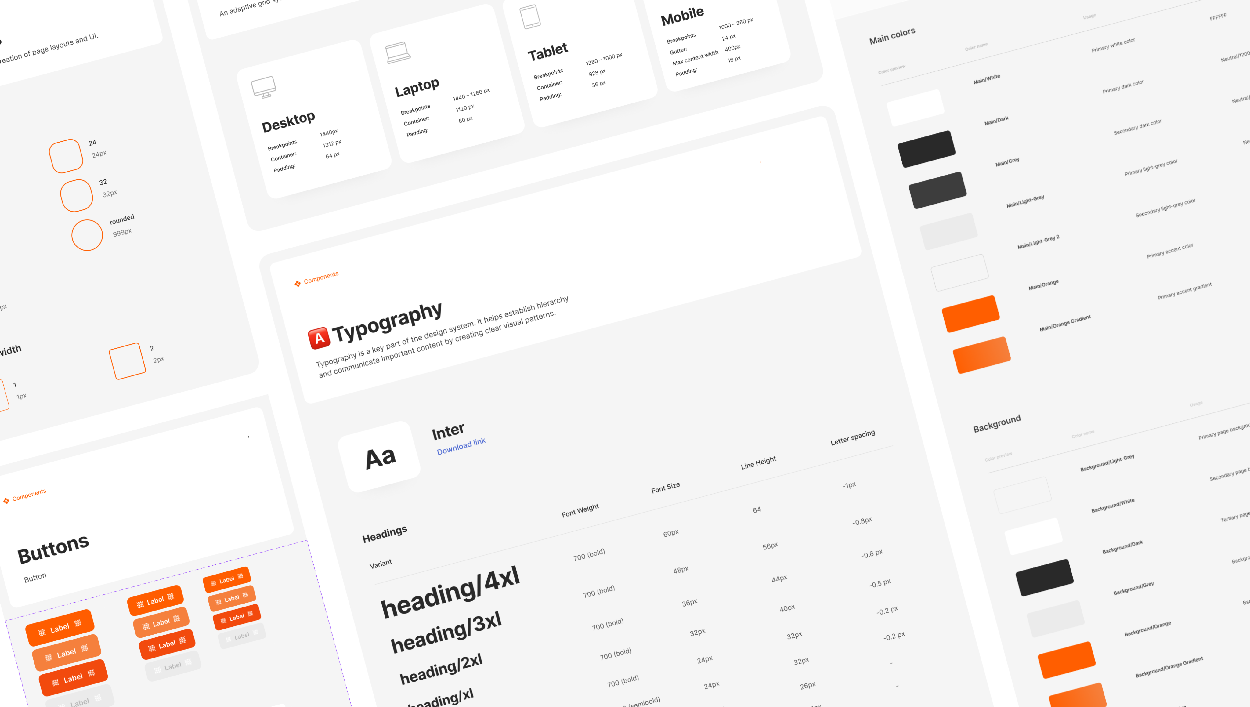
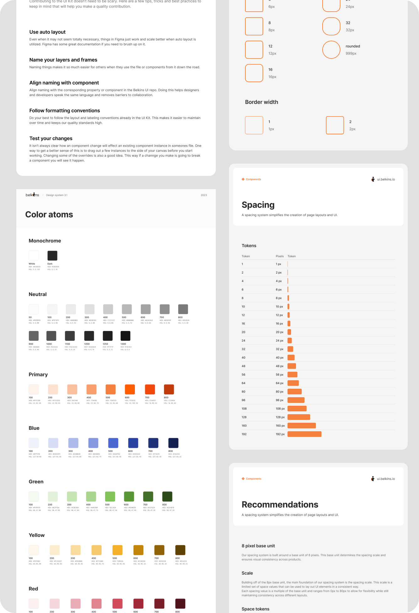
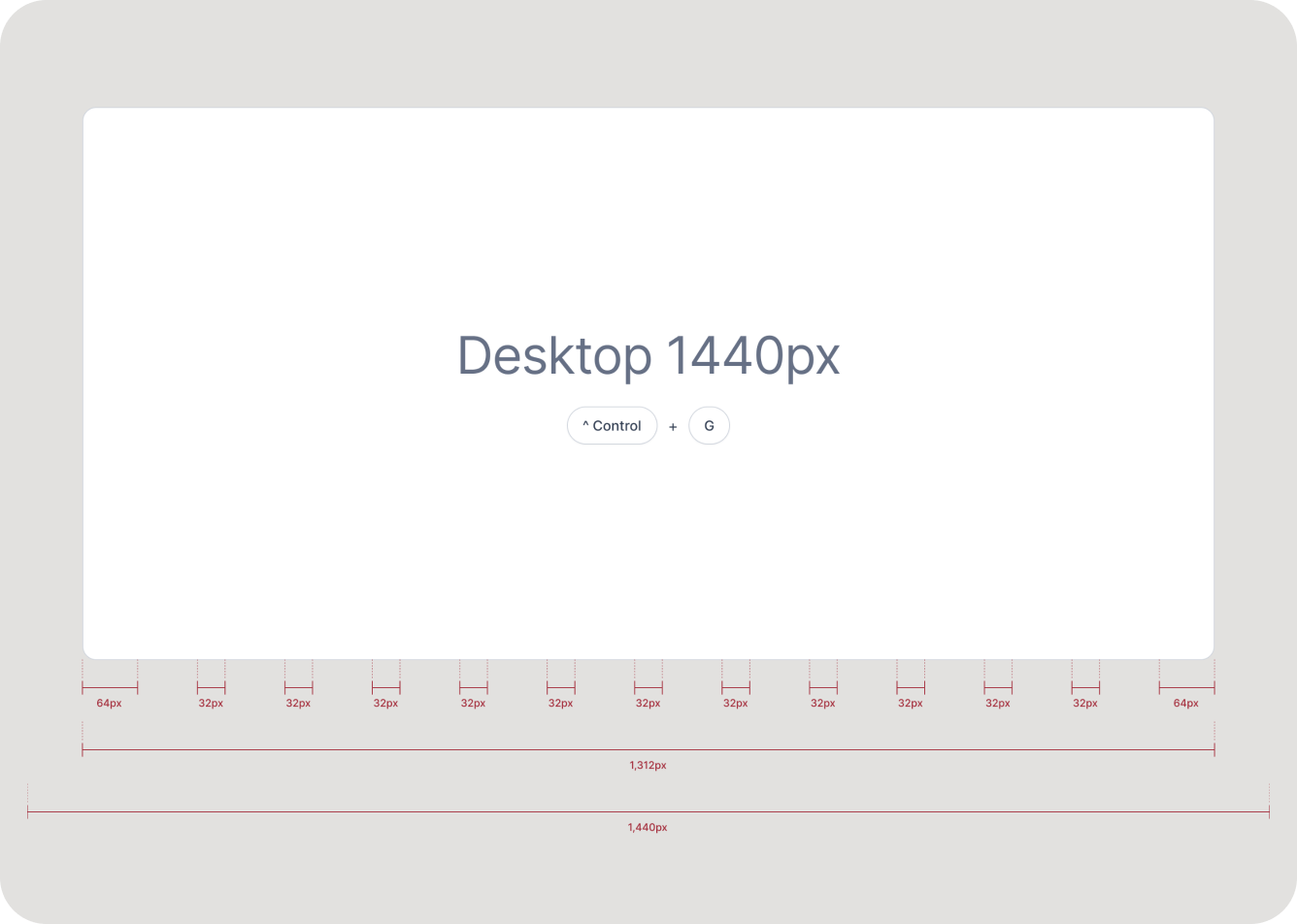
- Foundations - 8‑color palette, 8 px grid, unified icon set.
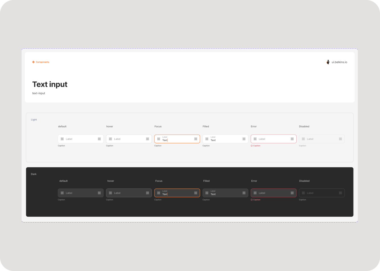
- Reusable components - buttons, forms, cards, navigation, empty states; built & tested in Figma + Storybook.
- Component repository - hosted storybook portal + private npm package; devs import, version, and update the design‑system with one command.
- Living documentation - usage rules, accessibility notes, change‑log.
- Roll‑out & feedback loops - piloted on homepage & pricing, then platform‑wide; weekly reviews with engineering.
Results
- Designers save ≈2 days per sprint via reusable components.
- Devs cut CSS bloat by ≈30 %, shipping faster and with fewer regressions.
- Internal audits show 95 % visual consistency and full WCAG 2.1 AA compliance.
- Leadership notes a “cohesive, trustworthy” brand presence across all touchpoints.
Take away
Standardizing the building blocks liberated both design and engineering to focus on real product innovation, not reinvention.


Previous
project
Next project

Let's create something
awesome
together


Building a scalable design system for B2B SaaS company
Client:
NDA
My role:
Product designer
Team:
Product designer, 2 front-end devs
Duration:
6 month
Design impact
Metric
Before
After
Impact
Design cycle time (avg )
5 days
3 days
40 %
Front‑end build time
7 days
5 days
30 %
UI inconsistency bugs
12
3
75 %
WCAG AA issues
18
1
97 %
Problem
- Visual chaos: 20 + shades of grey, dozens of type styles, one‑off components.
- Designers & devs rebuilt the same UI repeatedly, slowing sprints and bloating code.
- Accessibility gaps risked compliance and user frustration.
Audit highlight
- Colors: 22 unique greys across pages.
- Typography: 14 font‑size/weight combos in one screen.
- Redundancy: 9 versions of a primary button in the codebase.
- Spacing: Inconsistent margins broke visual rhythm.
Solution
- Foundations - 8‑color palette, 8 px grid, unified icon set.
- Reusable components - buttons, forms, cards, navigation, empty states; built & tested in Figma + Storybook.
- Component repository - hosted storybook portal + private npm package; devs import, version, and update the design‑system with one command.
- Living documentation - usage rules, accessibility notes, change‑log.
- Roll‑out & feedback loops - piloted on homepage & pricing, then platform‑wide; weekly reviews with engineering.
Results
- Designers save ≈2 days per sprint via reusable components.
- Devs cut CSS bloat by ≈30 %, shipping faster and with fewer regressions.
- Internal audits show 95 % visual consistency and full WCAG 2.1 AA compliance.
- Leadership notes a “cohesive, trustworthy” brand presence across all touchpoints.
Take away
Standardizing the building blocks liberated both design and engineering to focus on real product innovation, not reinvention.
Previous project
Next project
Let's create something
awesome
together
Building a scalable design system for B2B SaaS company
Client:
NDA
My role:
Product designer
Team:
Product designer, 2 front-end devs
Duration:
6 month
Design impact
Metric
Before
After
Impact
Design cycle time (avg )
5 days
3 days
40 %
Front‑end build time
7 days
5 days
30 %
UI inconsistency bugs
12
3
75 %
WCAG AA issues
18
1
97 %
Problem
- Visual chaos: 20 + shades of grey, dozens of type styles, one‑off components.
- Designers & devs rebuilt the same UI repeatedly, slowing sprints and bloating code.
- Accessibility gaps risked compliance and user frustration.
Audit highlight
- Colors: 22 unique greys across pages.
- Typography: 14 font‑size/weight combos in one screen.
- Redundancy: 9 versions of a primary button in the codebase.
- Spacing: Inconsistent margins broke visual rhythm.
Solution
- Foundations - 8‑color palette, 8 px grid, unified icon set.
- Reusable components - buttons, forms, cards, navigation, empty states; built & tested in Figma + Storybook.
- Component repository - hosted storybook portal + private npm package; devs import, version, and update the design‑system with one command.
- Living documentation - usage rules, accessibility notes, change‑log.
- Roll‑out & feedback loops - piloted on homepage & pricing, then platform‑wide; weekly reviews with engineering.

Results
- Designers save ≈2 days per sprint via reusable components.
- Devs cut CSS bloat by ≈30 %, shipping faster and with fewer regressions.
- Internal audits show 95 % visual consistency and full WCAG 2.1 AA compliance.
- Leadership notes a “cohesive, trustworthy” brand presence across all touchpoints.
Take away
Standardizing the building blocks liberated both design and engineering to focus on real product innovation, not reinvention.
Previous project
Next project
Let's create something
awesome
together