
Download CV
Boosting Pricing page conversion through UI/UX Optimization
Client:
NDA
My role:
Product designer
Team:
Product designer, BA, Product Manager
Duration:
3 month
Design impact
Book‑a‑call rate
Before
3.2 %
After
6.8 %
Impact
110%
Form‑completion rate
Before
28 %
After
52 %
Impact
85 %
Pricing‑page bounce
Before
62 %
After
38 %
Impact
24 %
Form‑finish time
Before
4 m 20 s
After
1 m 50 s
Impact
58 %
Before
After
Problem
- Sales reported that 70% of leads were unclear on how the service integrated with their current processes.
- Marketing highlighted a 62% bounce rate on the pricing page.
- Management set an ambitious target: boost the conversion rate to 10% within three months.
User Behavior Analysis
- Heatmaps (via Hotjar) showed that only 30% of users reached the case studies section.
- Session recordings (via Microsoft Clarity) revealed that 40% of users clicked on non-interactive elements, signaling unclear UI cues.
- On the pricing page, 50% of visitors left after viewing the pricing tiers without engaging with the “Book a call” CTA.
- Form analytics indicated that 60% of users abandoned the call booking form at the “Tell us about your company” field due to information overload.
Solution
To fix that, I built and demoed three radically different pricing concepts:
- Option 1 – Configurator gridVisitors pick a single outbound channel, adjust volume with steppers, and see the price update live.
- Option 2 – Full custom bundleA sidebar lets buyers combine any outreach channels they want; the quote recalculates on the fly.
- Option 3 – Two clear, static packages ★Plain comparison table: “Omnichannel” vs “Omnichannel Plus”, each framed by the yearly appointment volume.
Option 1
Option 2
Option 3

Results
Options 1 and 2 were slick and interactive, but five quick hallway tests exposed a problem: prospects spent more time fiddling with controls than understanding value. The simplest design - Option 3 - won every clarity checkpoint (“I get it immediately” in 4 / 5 sessions) and needed almost no engineering effort.
Engineering spent just 14 hours swapping the old grid for the new two‑plan layout, neutralising the palette, and adding a sticky bar.
8 weeks post‑launch, booked calls had more than 2x, bounce rate fell by 3x, and the booking form took less than 3 minutes to finish.
Take away
When users are drowning in choices, reducing interactivity can be the most powerful UX decision you make.

Next project

Let's create something
awesome
together


Boosting Pricing page conversion through UI/UX Optimization
Client:
NDA
My role:
Product designer
Team:
Product designer, BA, Product Manager
Duration:
3 month
Design impact
Metric
Before
After
Impact
Book‑a‑call rate
3.2 %
6.8 %
110 %
Form‑completion rate
28 %
52 %
85 %
Pricing‑page bounce
62 %
38 %
38 %
Form‑finish time
4 m 20 s
1 m 50 s
58 %
Before
After
Problem
- Sales reported that 70% of leads were unclear on how the service integrated with their current processes.
- Marketing highlighted a 62% bounce rate on the pricing page.
- Management set an ambitious target: boost the conversion rate to 10% within three months.
User Behavior Analysis
- Heatmaps (via Hotjar) showed that only 30% of users reached the case studies section.
- Session recordings (via Microsoft Clarity) revealed that 40% of users clicked on non-interactive elements, signaling unclear UI cues.
- On the pricing page, 50% of visitors left after viewing the pricing tiers without engaging with the “Book a call” CTA.
- Form analytics indicated that 60% of users abandoned the call booking form at the “Tell us about your company” field due to information overload.
Solution
To fix that, I built and demoed three radically different pricing concepts:
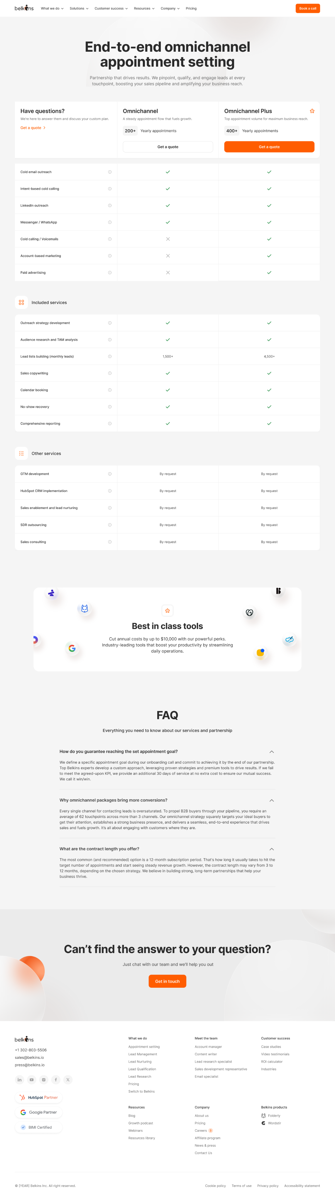
- Option 1 – Configurator gridVisitors pick a single outbound channel, adjust volume with steppers, and see the price update live.
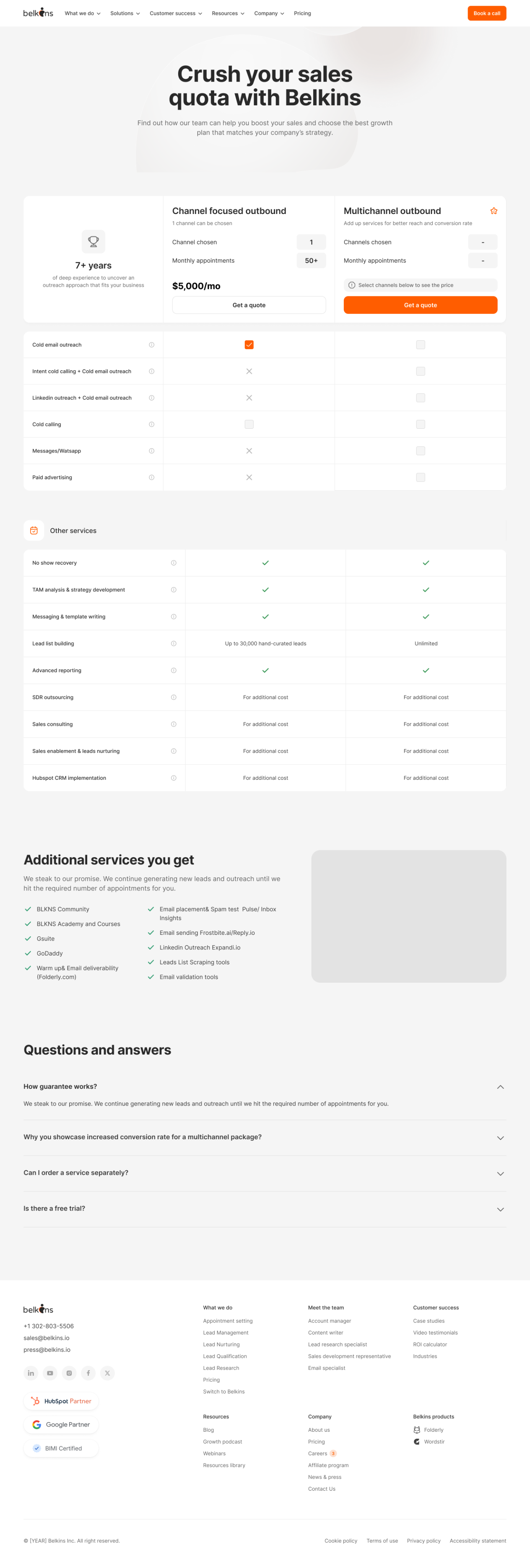
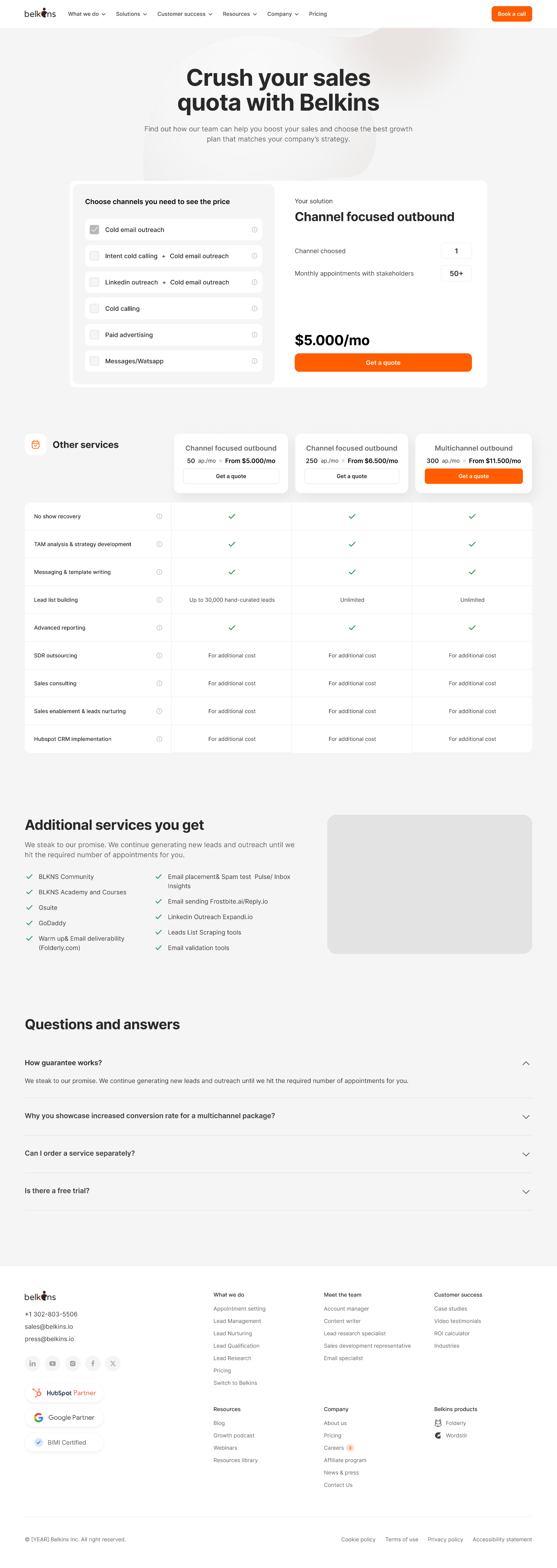
- Option 2 – Full custom bundleA sidebar lets buyers combine any outreach channels they want; the quote recalculates on the fly.
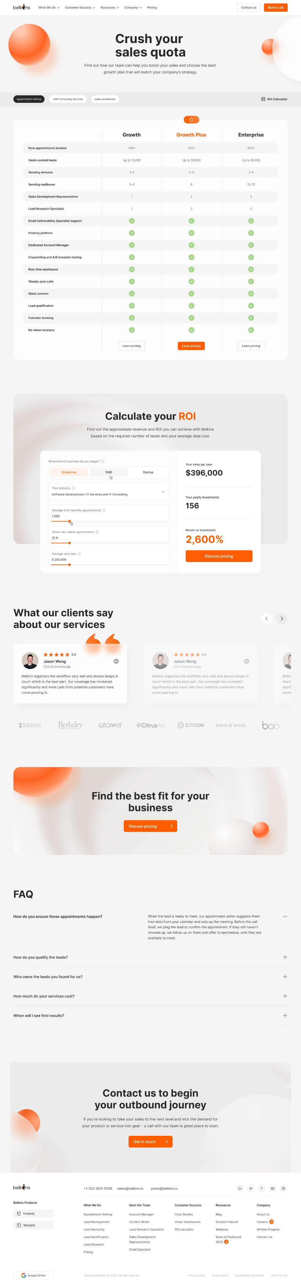
- Option 3 – Two clear, static packages ★Plain comparison table: “Omnichannel” vs “Omnichannel Plus”, each framed by the yearly appointment volume.
Option 1
Option 2
Option 3

Results
Options 1 and 2 were slick and interactive, but five quick hallway tests exposed a problem: prospects spent more time fiddling with controls than understanding value. The simplest design - Option 3 - won every clarity checkpoint (“I get it immediately” in 4 / 5 sessions) and needed almost no engineering effort.
Engineering spent just 14 hours swapping the old grid for the new two‑plan layout, neutralising the palette, and adding a sticky bar.
8 weeks post‑launch, booked calls had more than 2x, bounce rate fell by 3x, and the booking form took less than 3 minutes to finish.
Take away
When users are drowning in choices, reducing interactivity can be the most powerful UX decision you make.
Boosting Pricing page conversion through UI/UX Optimization
Client:
NDA
My role:
Product designer
Team:
Product designer, BA, Product Manager
Duration:
3 month
Design impact
Metric
Before
After
Impact
Book‑a‑call rate
3.2 %
6.8 %
110 %
Form‑completion rate
28 %
52 %
85 %
Pricing‑page bounce
62 %
38 %
38 %
Form‑finish time
4 m 20 s
1 m 50 s
58 %
Before
After
Problem
- Sales reported that 70% of leads were unclear on how the service integrated with their current processes.
- Marketing highlighted a 62% bounce rate on the pricing page.
- Management set an ambitious target: boost the conversion rate to 10% within three months.
User Behavior Analysis
- Heatmaps (via Hotjar) showed that only 30% of users reached the case studies section.
- Session recordings (via Microsoft Clarity) revealed that 40% of users clicked on non-interactive elements, signaling unclear UI cues.
- On the pricing page, 50% of visitors left after viewing the pricing tiers without engaging with the “Book a call” CTA.
- Form analytics indicated that 60% of users abandoned the call booking form at the “Tell us about your company” field due to information overload.
Solution
To fix that, I built and demoed three radically different pricing concepts:
- Option 1 – Configurator gridVisitors pick a single outbound channel, adjust volume with steppers, and see the price update live.
- Option 2 – Full custom bundleA sidebar lets buyers combine any outreach channels they want; the quote recalculates on the fly.
- Option 3 – Two clear, static packages ★Plain comparison table: “Omnichannel” vs “Omnichannel Plus”, each framed by the yearly appointment volume.
Option 1
Option 2
Option 3

Results
Options 1 and 2 were slick and interactive, but five quick hallway tests exposed a problem: prospects spent more time fiddling with controls than understanding value. The simplest design - Option 3 - won every clarity checkpoint (“I get it immediately” in 4 / 5 sessions) and needed almost no engineering effort.
Engineering spent just 14 hours swapping the old grid for the new two‑plan layout, neutralising the palette, and adding a sticky bar.
8 weeks post‑launch, booked calls had more than 2x, bounce rate fell by 3x, and the booking form took less than 3 minutes to finish.
Take away
When users are drowning in choices, reducing interactivity can be the most powerful UX decision you make.
Next project
Let's create something
awesome
together
Boosting Pricing page conversion through UI/UX Optimization
Client:
NDA
My role:
Product designer
Team:
Product designer, BA, Product Manager
Duration:
3 month
Design impact
Metric
Before
After
Impact
Book‑a‑call rate
3.2 %
6.8 %
110 %
Form‑completion rate
28 %
52 %
85 %
Pricing‑page bounce
62 %
38 %
38 %
Form‑finish time
4 m 20 s
1 m 50 s
58 %
Before
After
Problem
- Sales reported that 70% of leads were unclear on how the service integrated with their current processes.
- Marketing highlighted a 62% bounce rate on the pricing page.
- Management set an ambitious target: boost the conversion rate to 10% within three months.
User Behavior Analysis
- Heatmaps (via Hotjar) showed that only 30% of users reached the case studies section.
- Session recordings (via Microsoft Clarity) revealed that 40% of users clicked on non-interactive elements, signaling unclear UI cues.
- On the pricing page, 50% of visitors left after viewing the pricing tiers without engaging with the “Book a call” CTA.
- Form analytics indicated that 60% of users abandoned the call booking form at the “Tell us about your company” field due to information overload.
Solution
To fix that, I built and demoed three radically different pricing concepts:
- Option 1 – Configurator gridVisitors pick a single outbound channel, adjust volume with steppers, and see the price update live.
- Option 2 – Full custom bundleA sidebar lets buyers combine any outreach channels they want; the quote recalculates on the fly.
- Option 3 – Two clear, static packages ★Plain comparison table: “Omnichannel” vs “Omnichannel Plus”, each framed by the yearly appointment volume.
Option 1
Option 2
Option 3
Results
Options 1 and 2 were slick and interactive, but five quick hallway tests exposed a problem: prospects spent more time fiddling with controls than understanding value. The simplest design - Option 3 - won every clarity checkpoint (“I get it immediately” in 4 / 5 sessions) and needed almost no engineering effort.
Engineering spent just 14 hours swapping the old grid for the new two‑plan layout, neutralising the palette, and adding a sticky bar.
8 weeks post‑launch, booked calls had more than 2x, bounce rate fell by 3x, and the booking form took less than 3 minutes to finish.
Take away
When users are drowning in choices, reducing interactivity can be the most powerful UX decision you make.
Next project
Let's create something
awesome
together